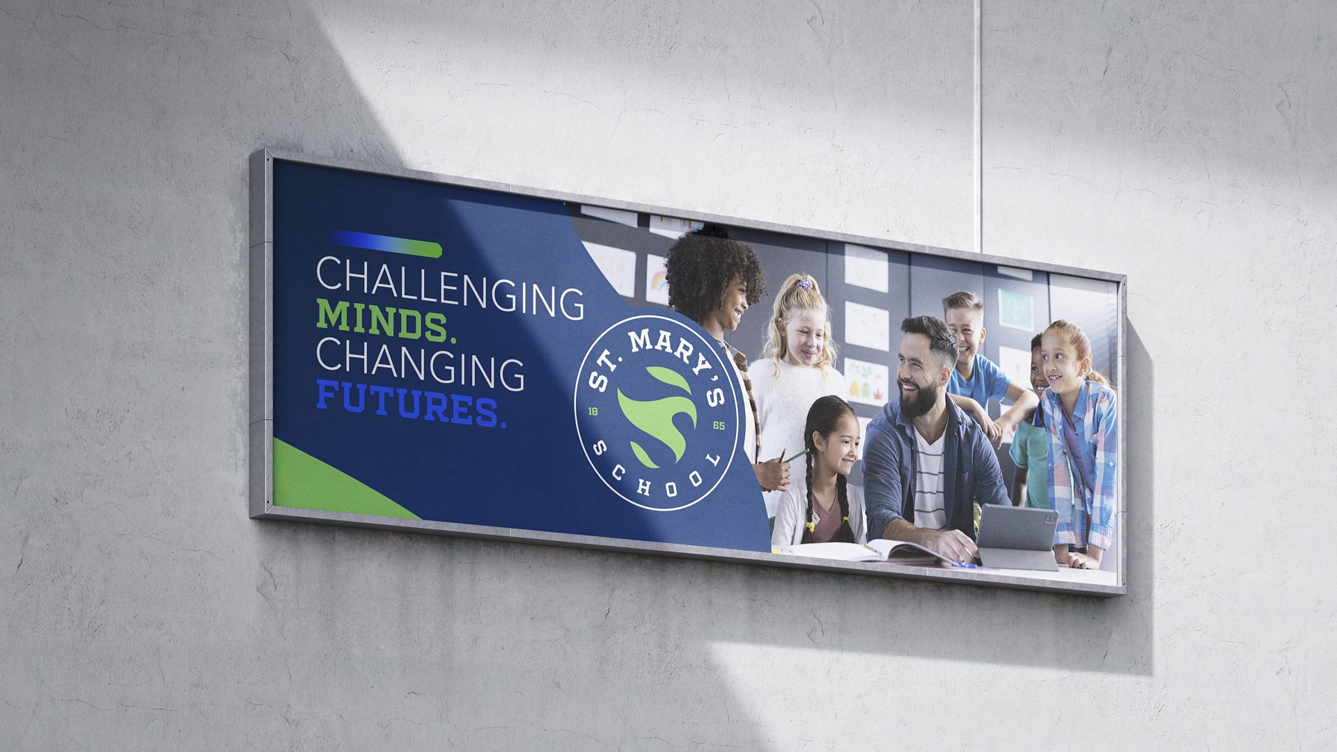
For this school branding exercise, Solve + Create explored how one visual identity could connect St. Mary’s School’s academic life, campus communications and Crusaders athletics. The work is presented as a branding concept, rather than a claim of a completed school-wide rollout.
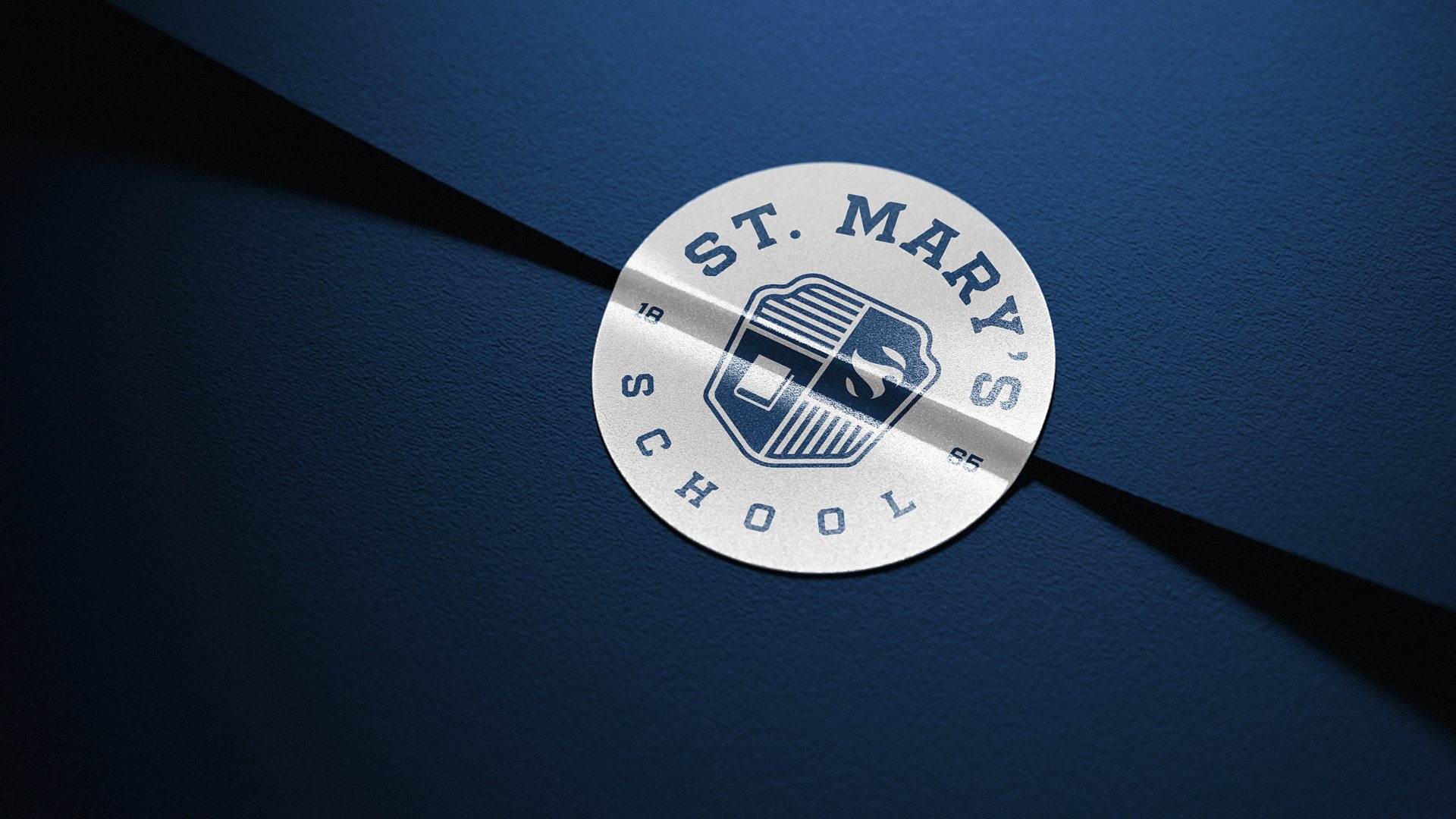
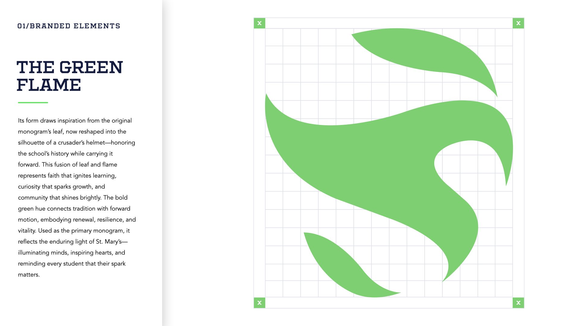
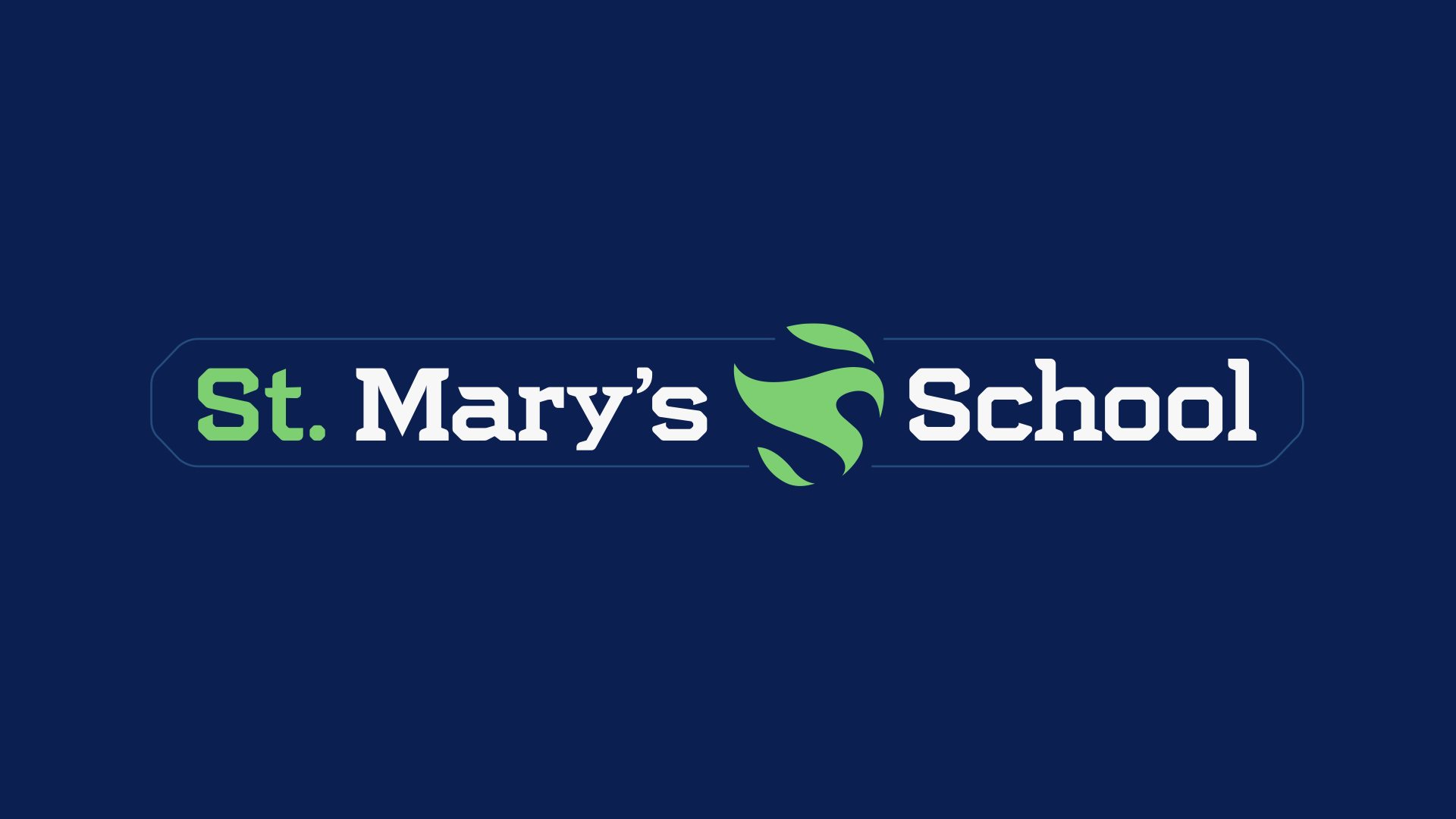
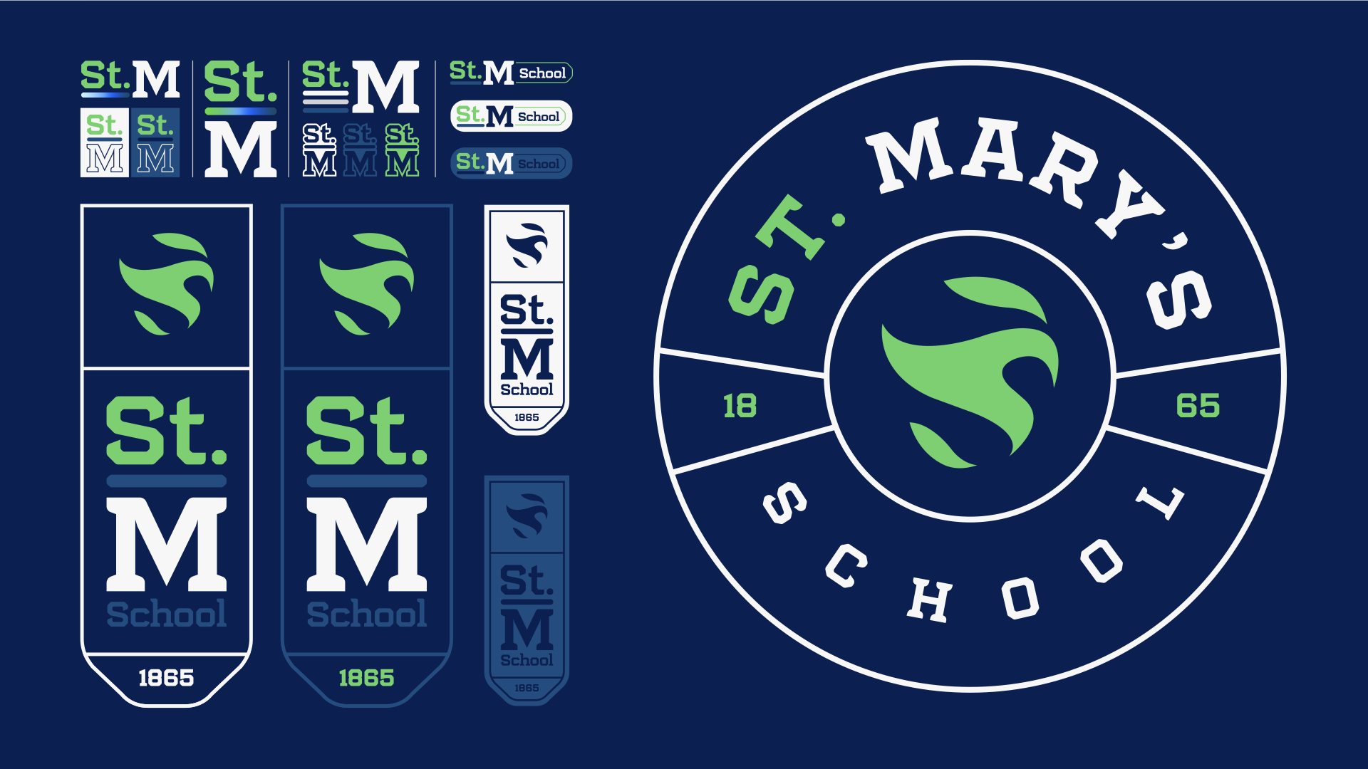
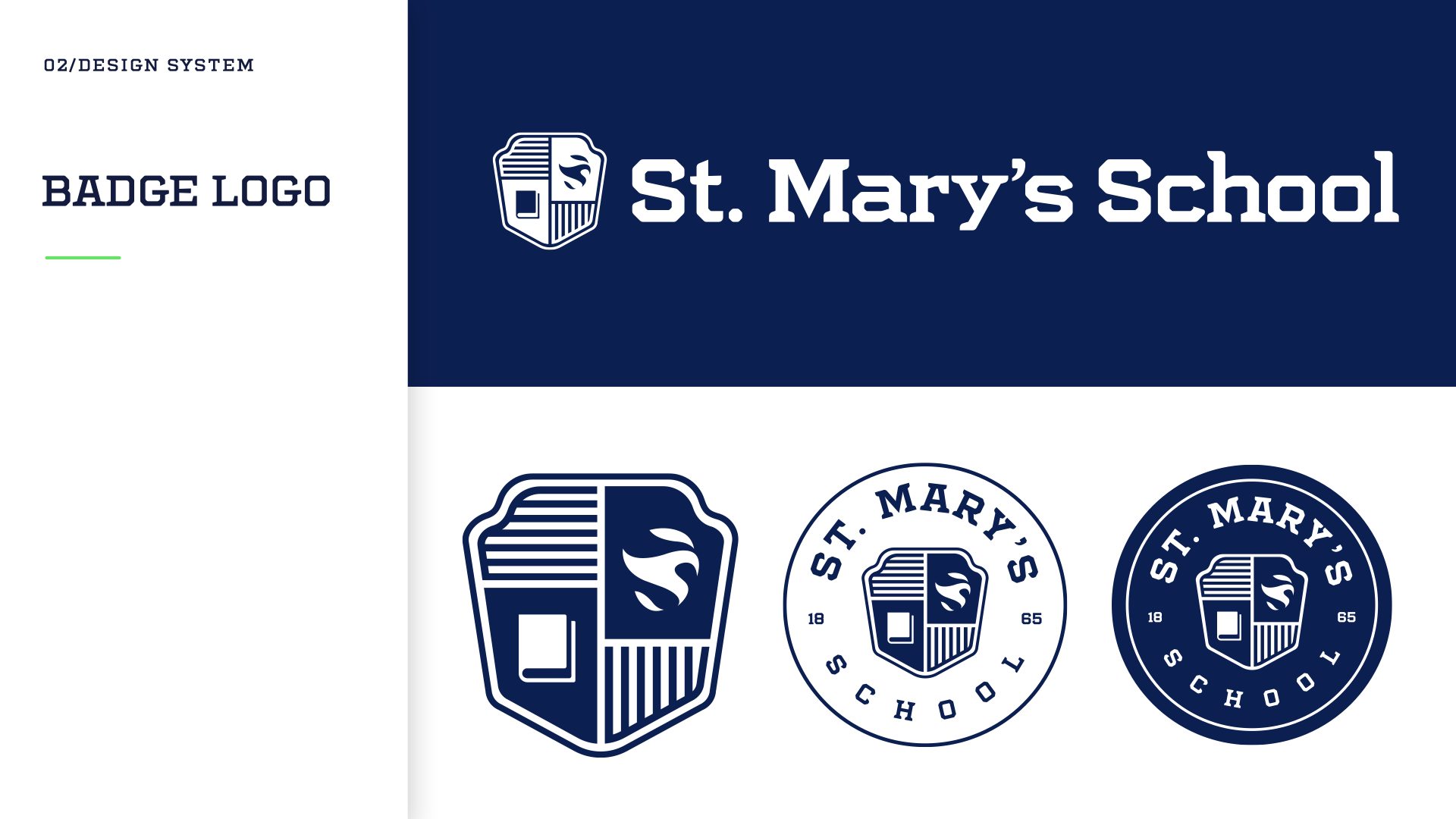
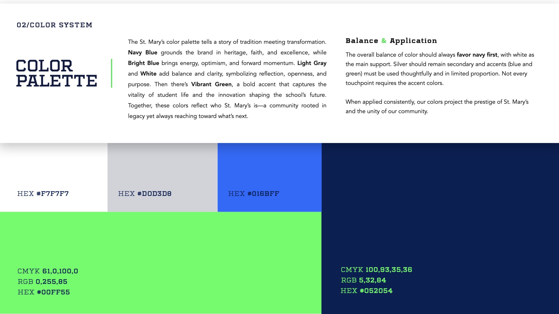
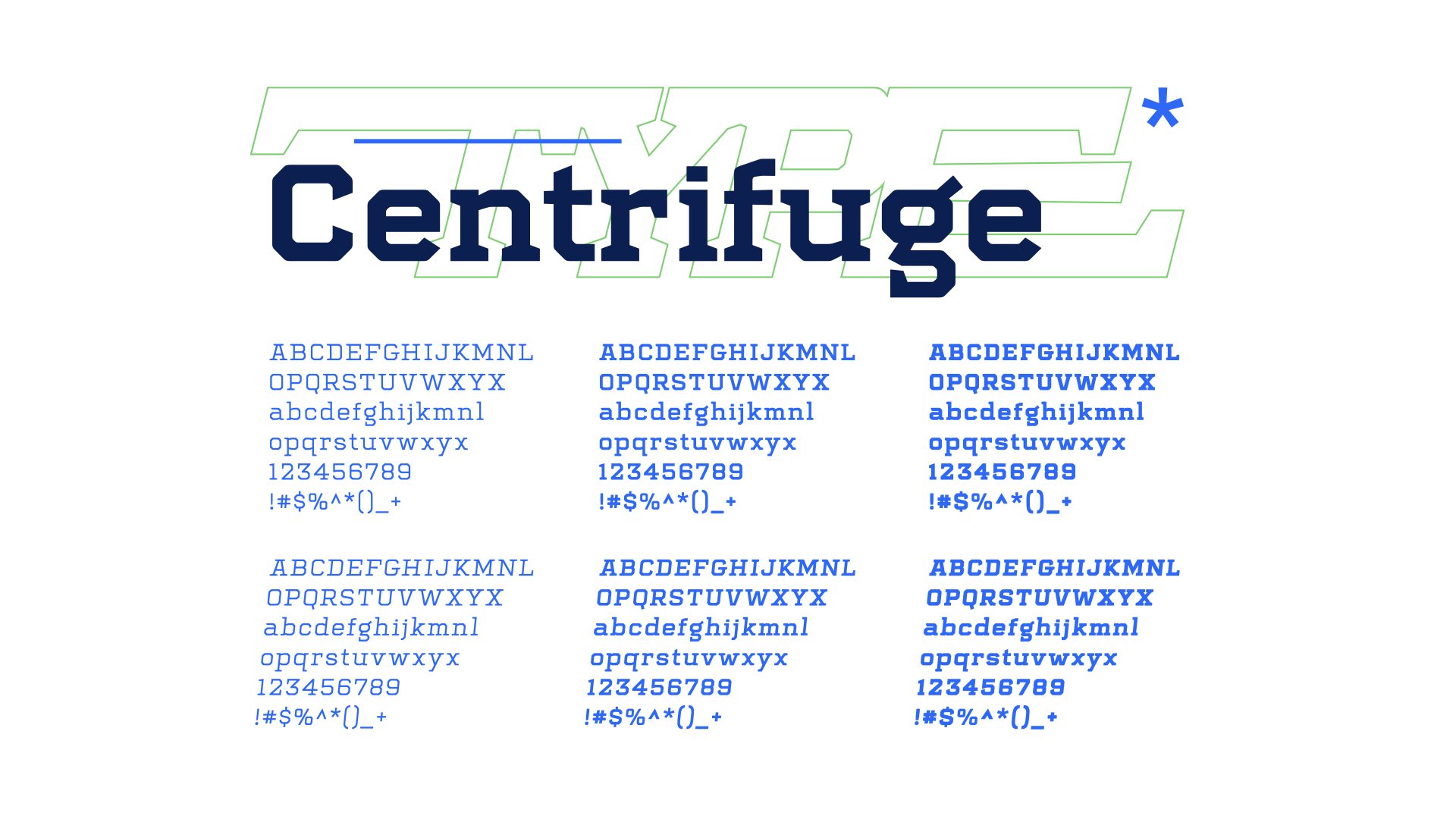
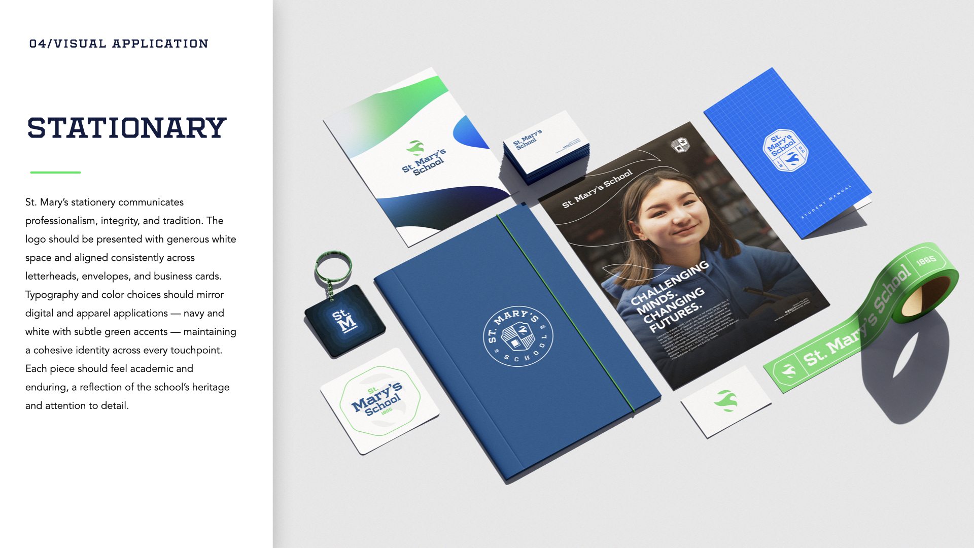
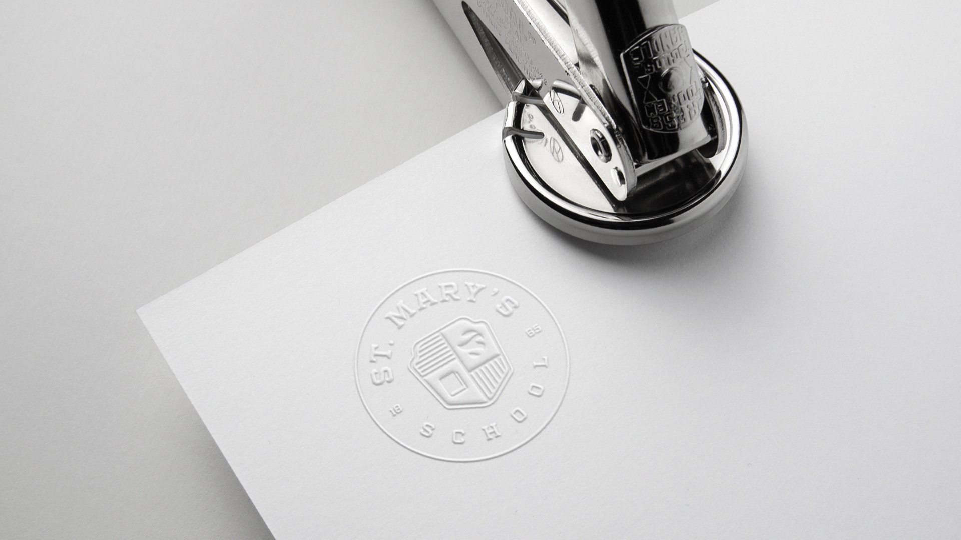
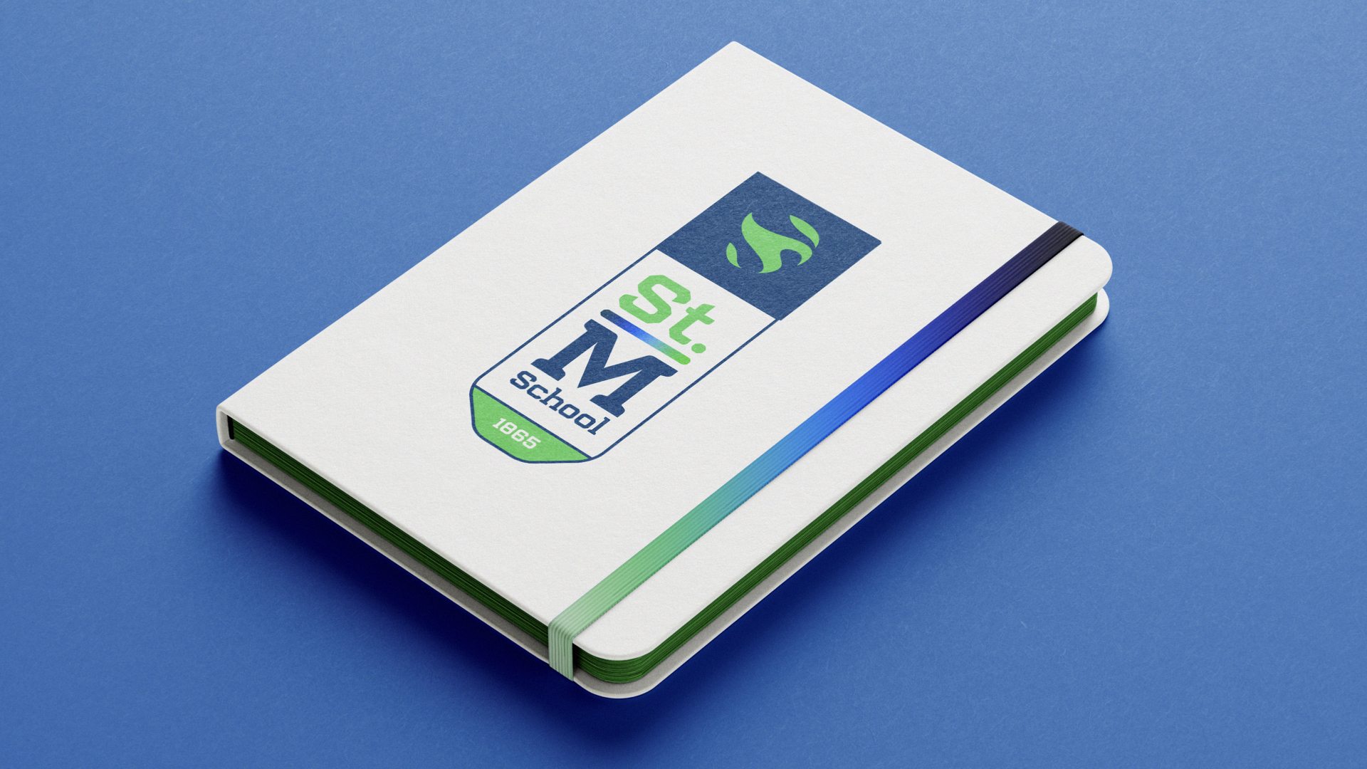
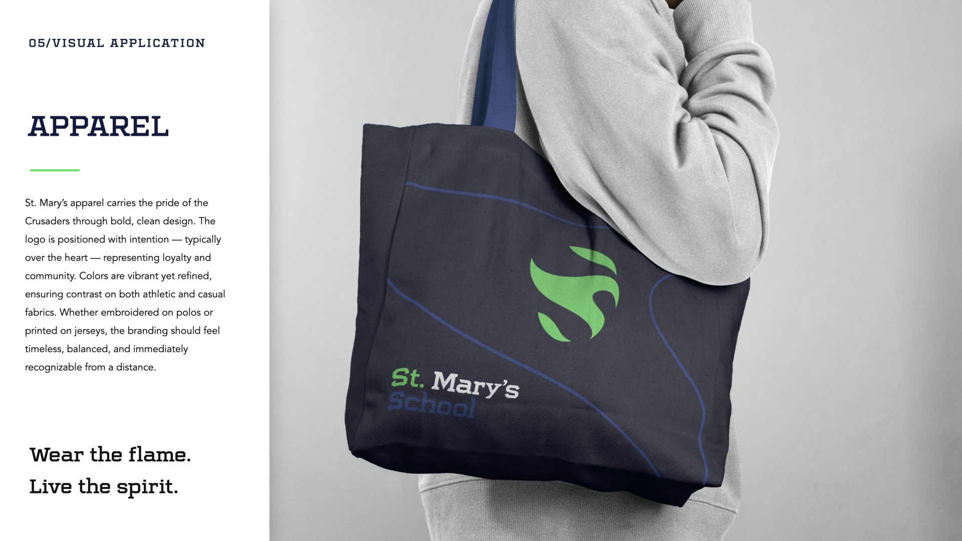
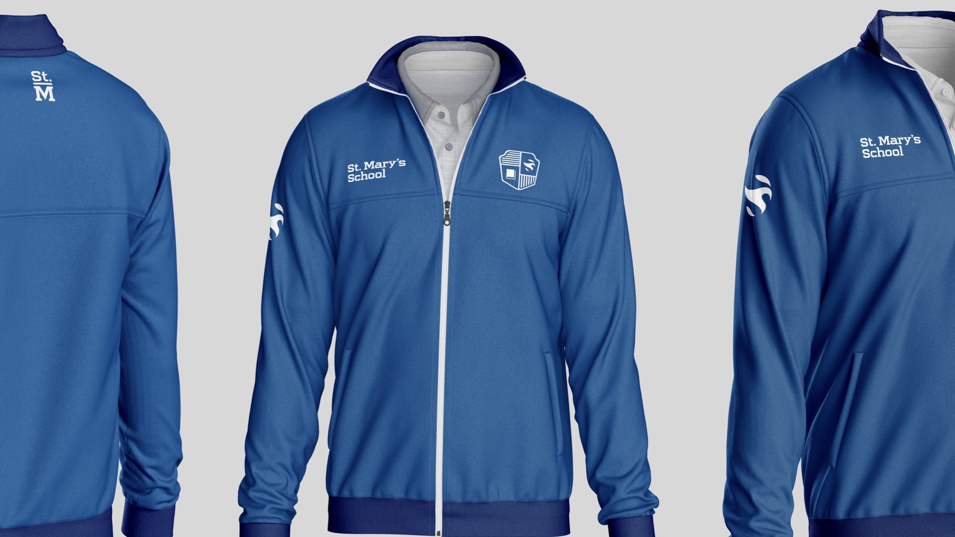
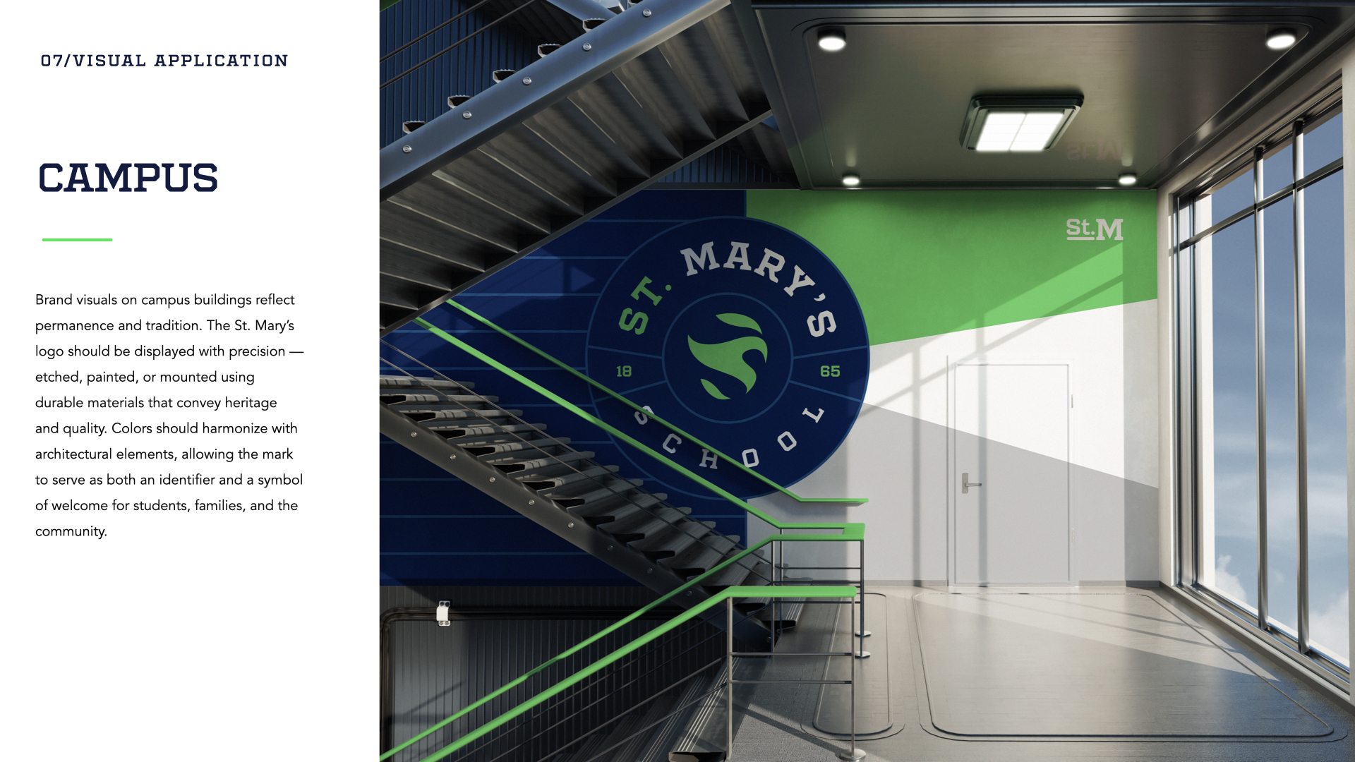
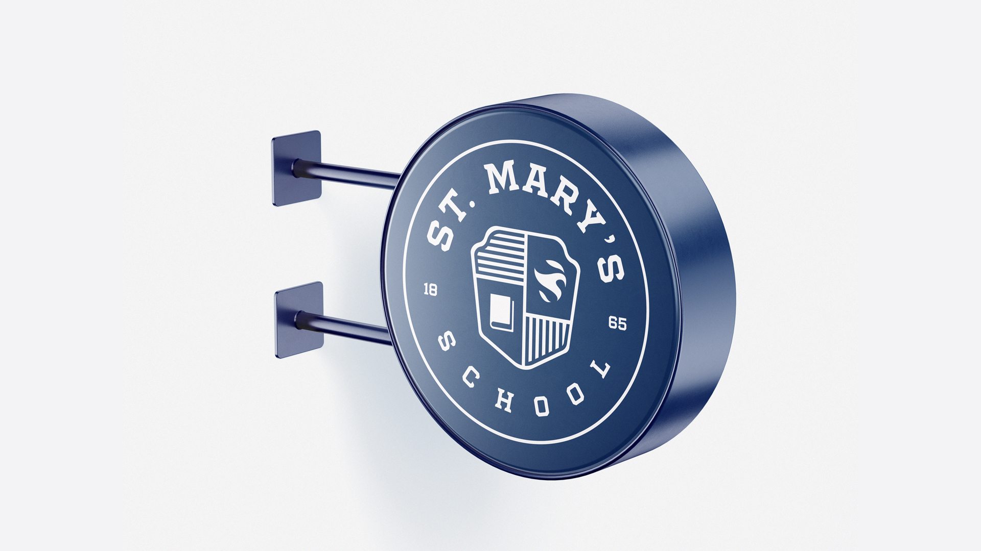
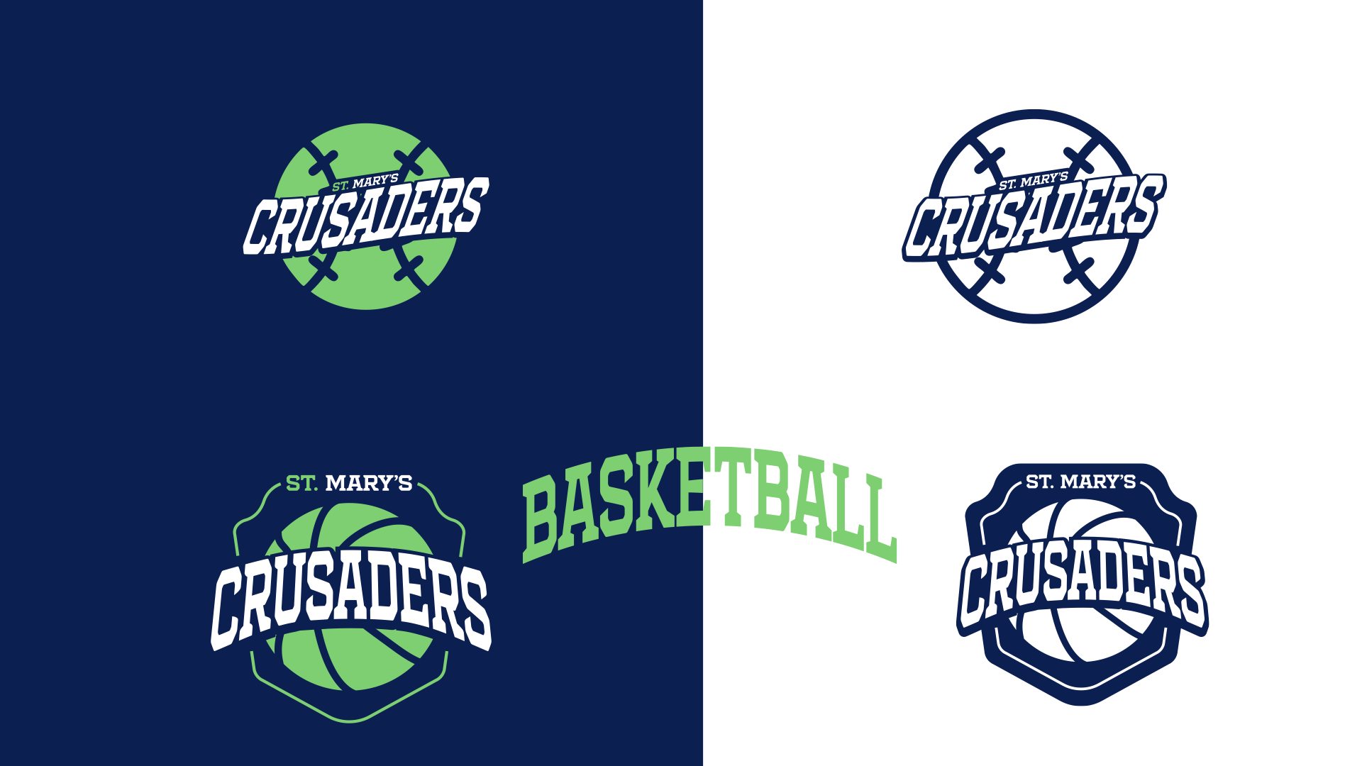
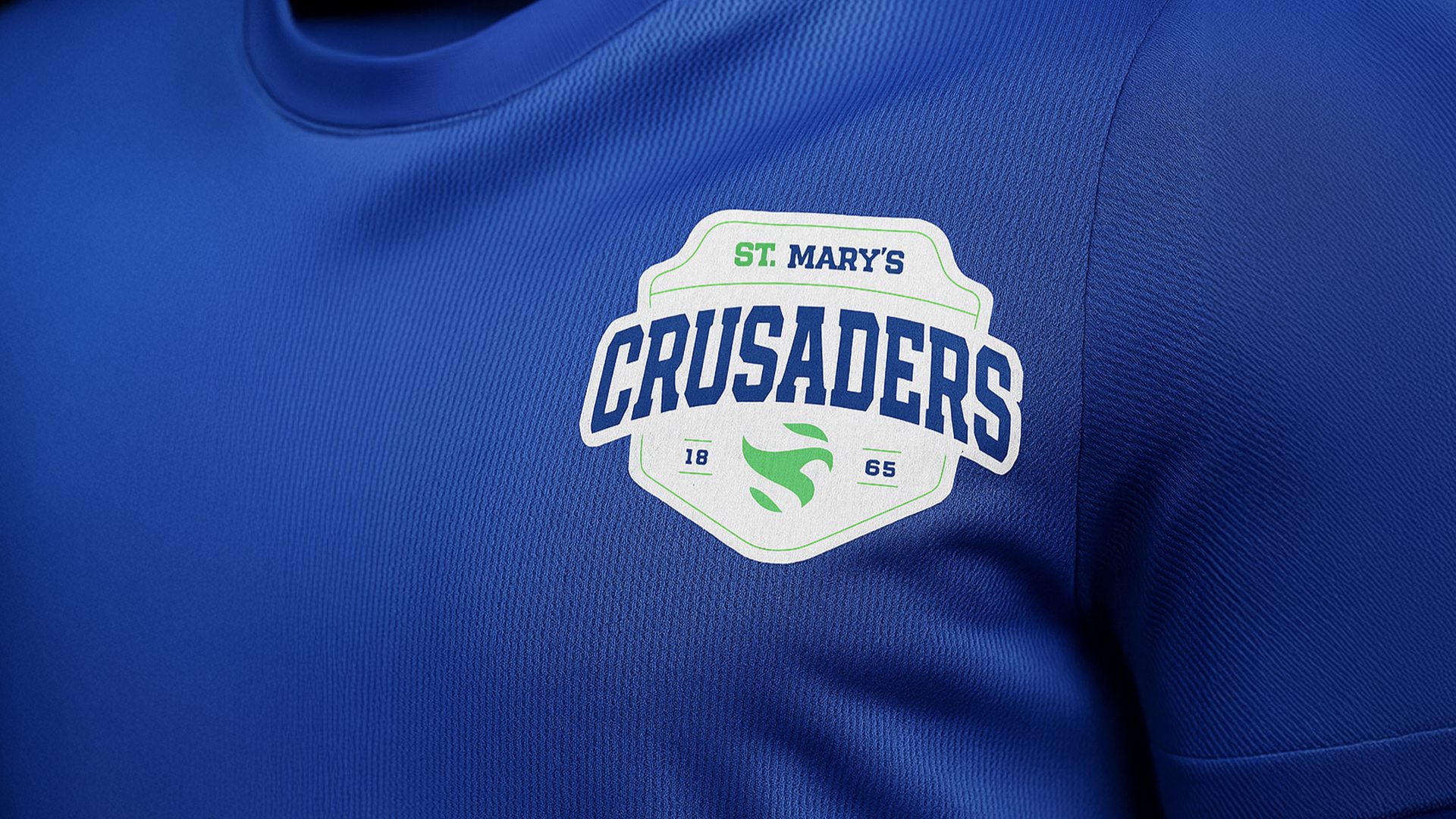
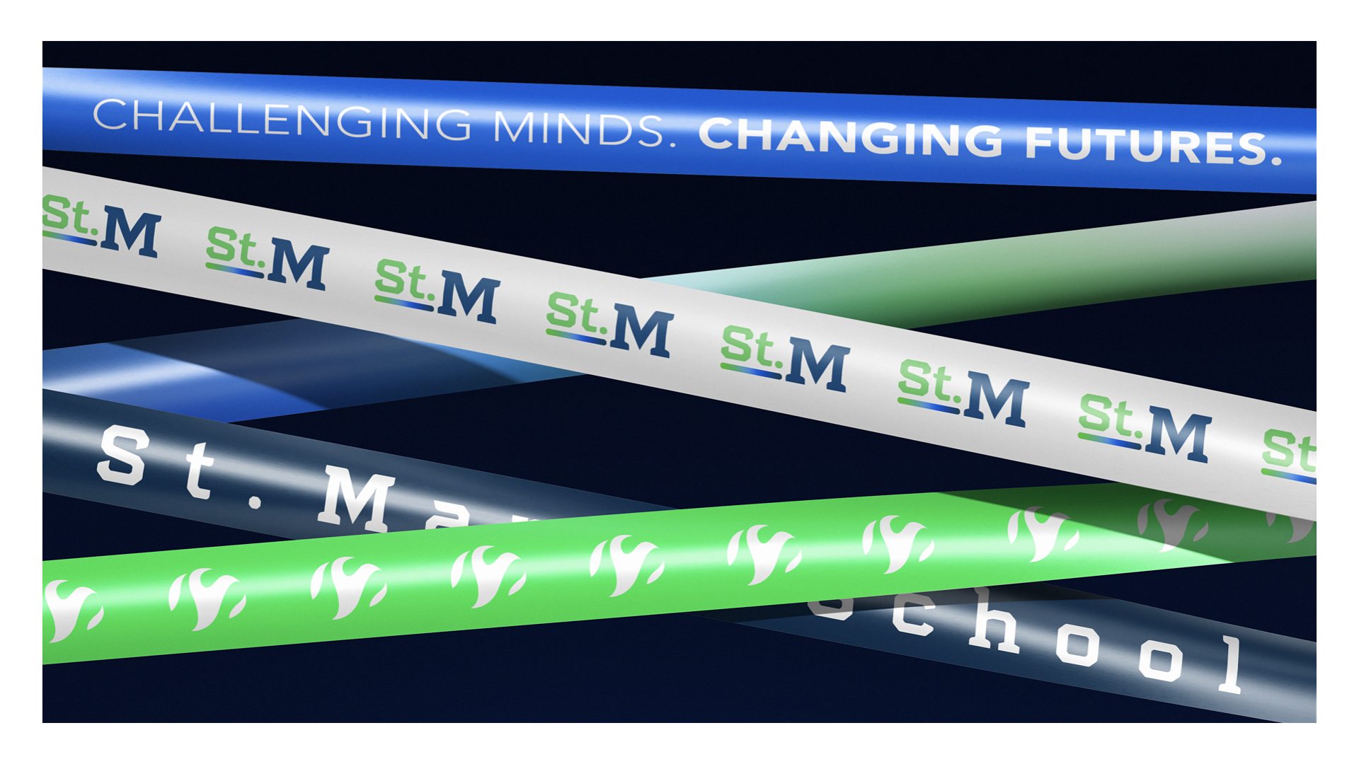
The identity centers on a green flame monogram inspired by the school’s original leaf mark, with a form that also evokes a Crusader helmet. Wordmarks, seals, badges and stacked letterforms create a family of marks for different contexts. The brand guidelines pair a navy-led palette with green and blue accents, Centrifuge headlines and Avenir body typography.
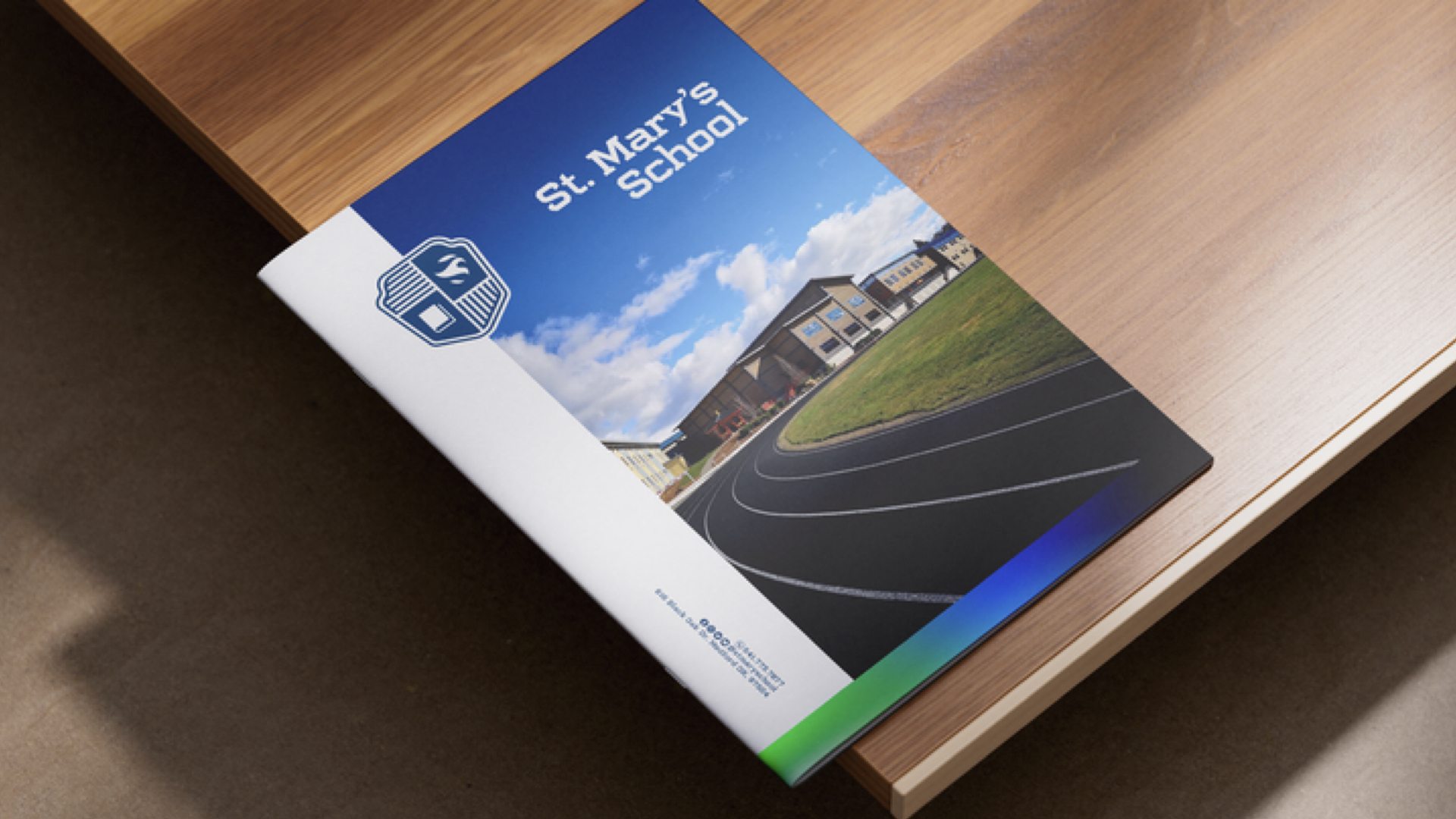
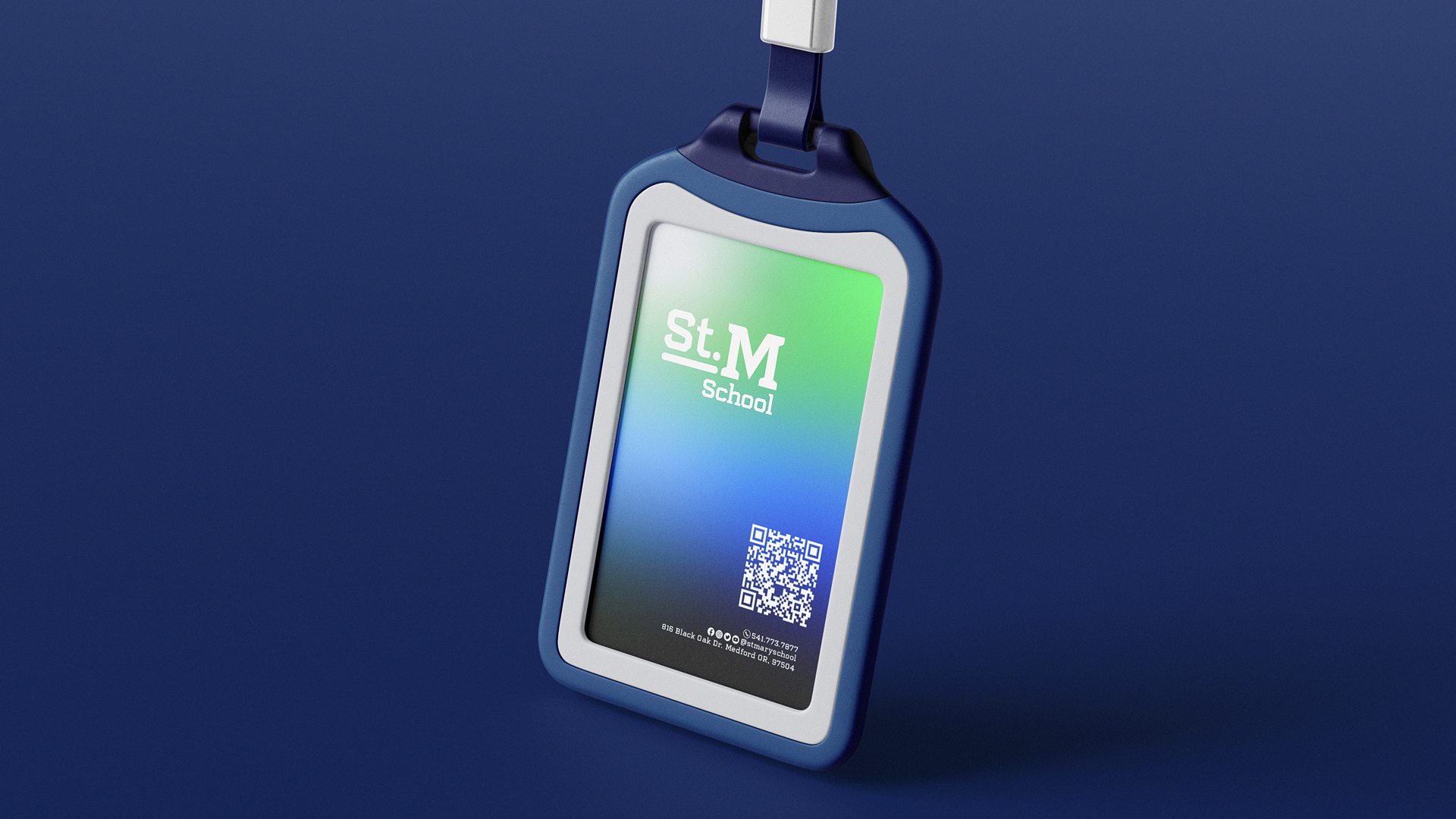
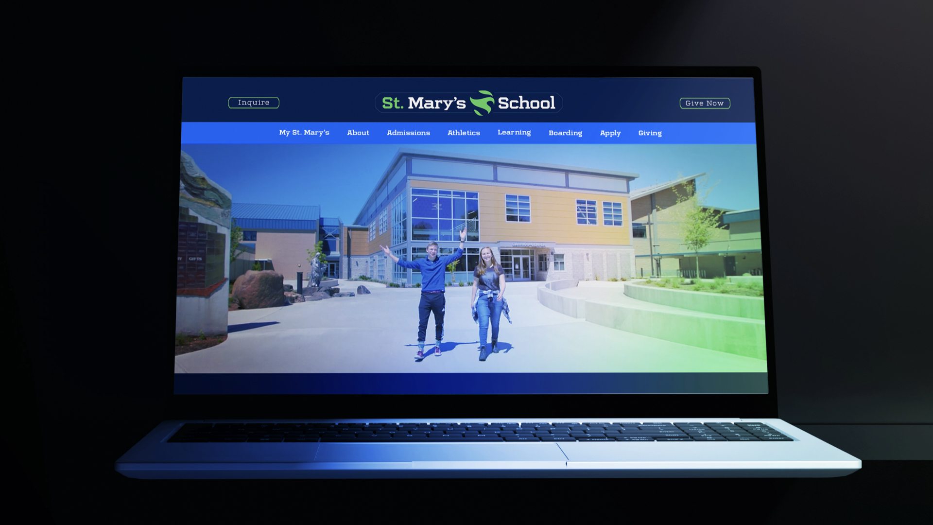
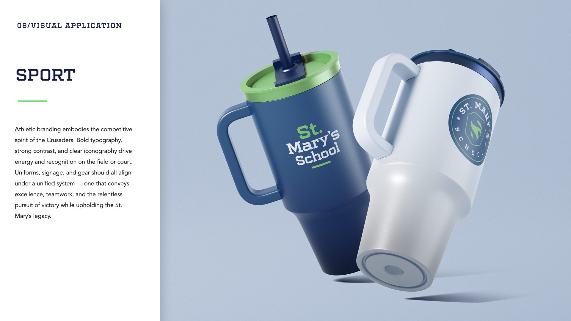
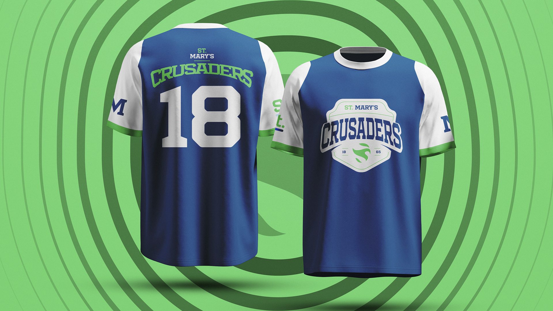
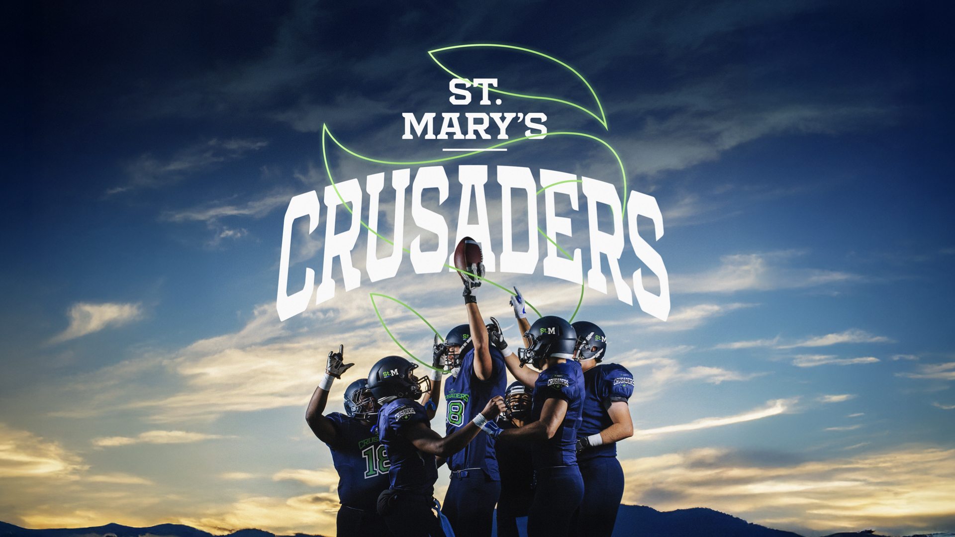
We explored the high-school brand through stationery, publications, apparel, digital mockups, campus signage and sports graphics. Together, these applications show how a school identity can carry a consistent visual language from everyday communications to the team spirit of athletics.