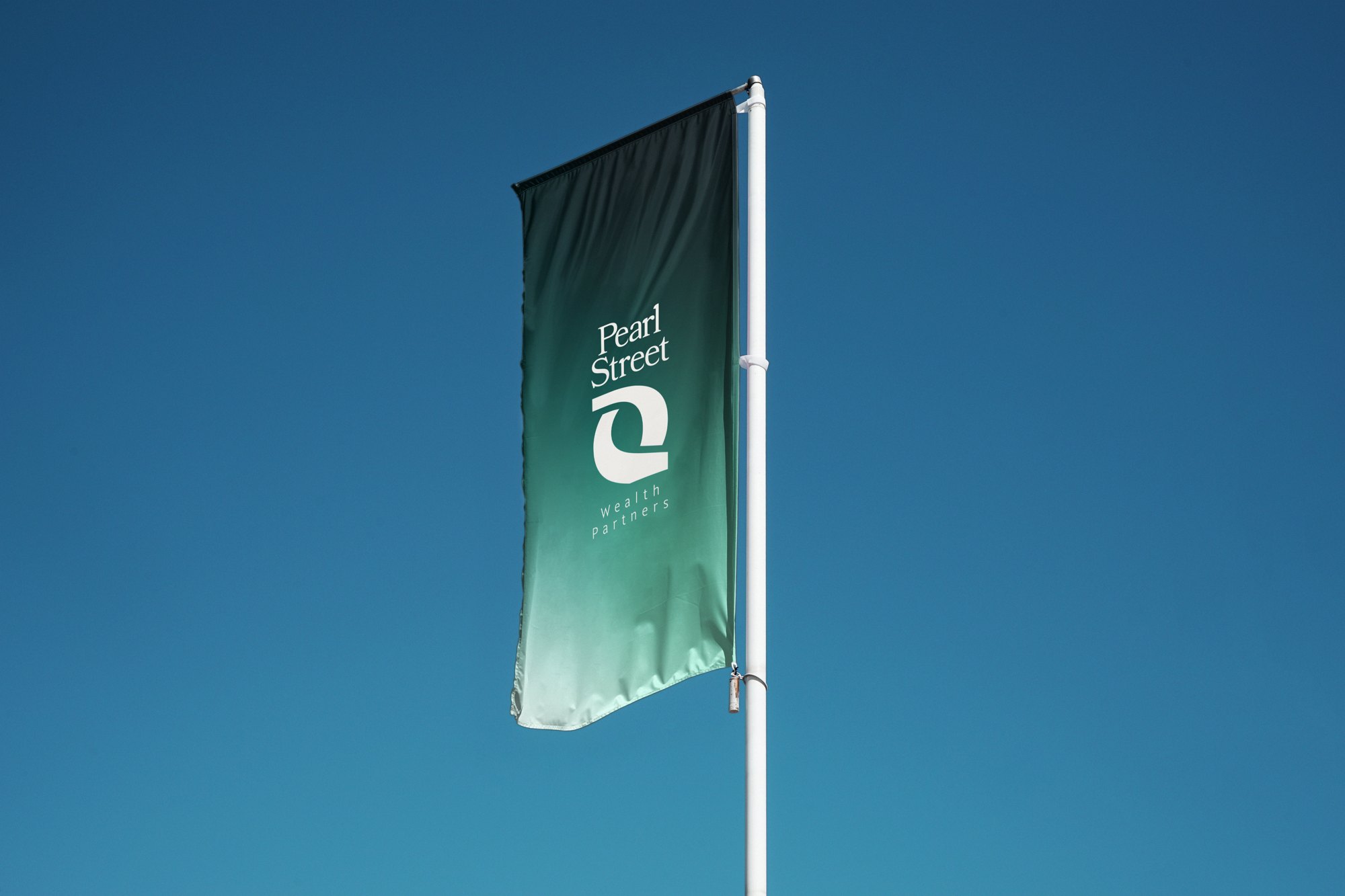
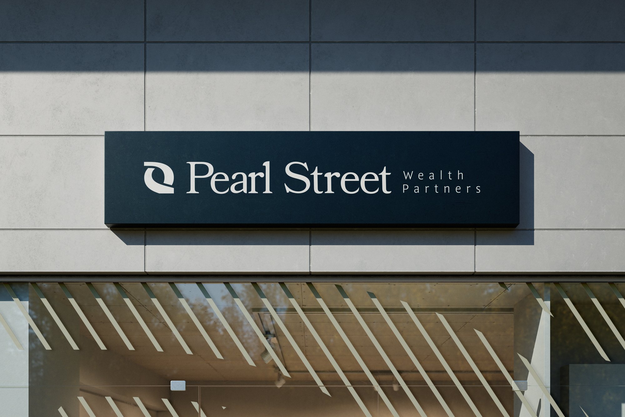
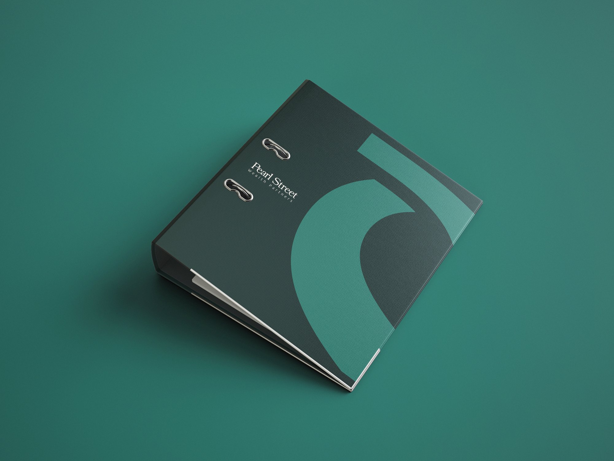
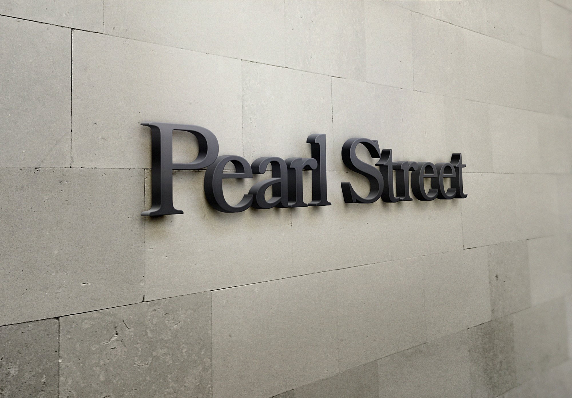
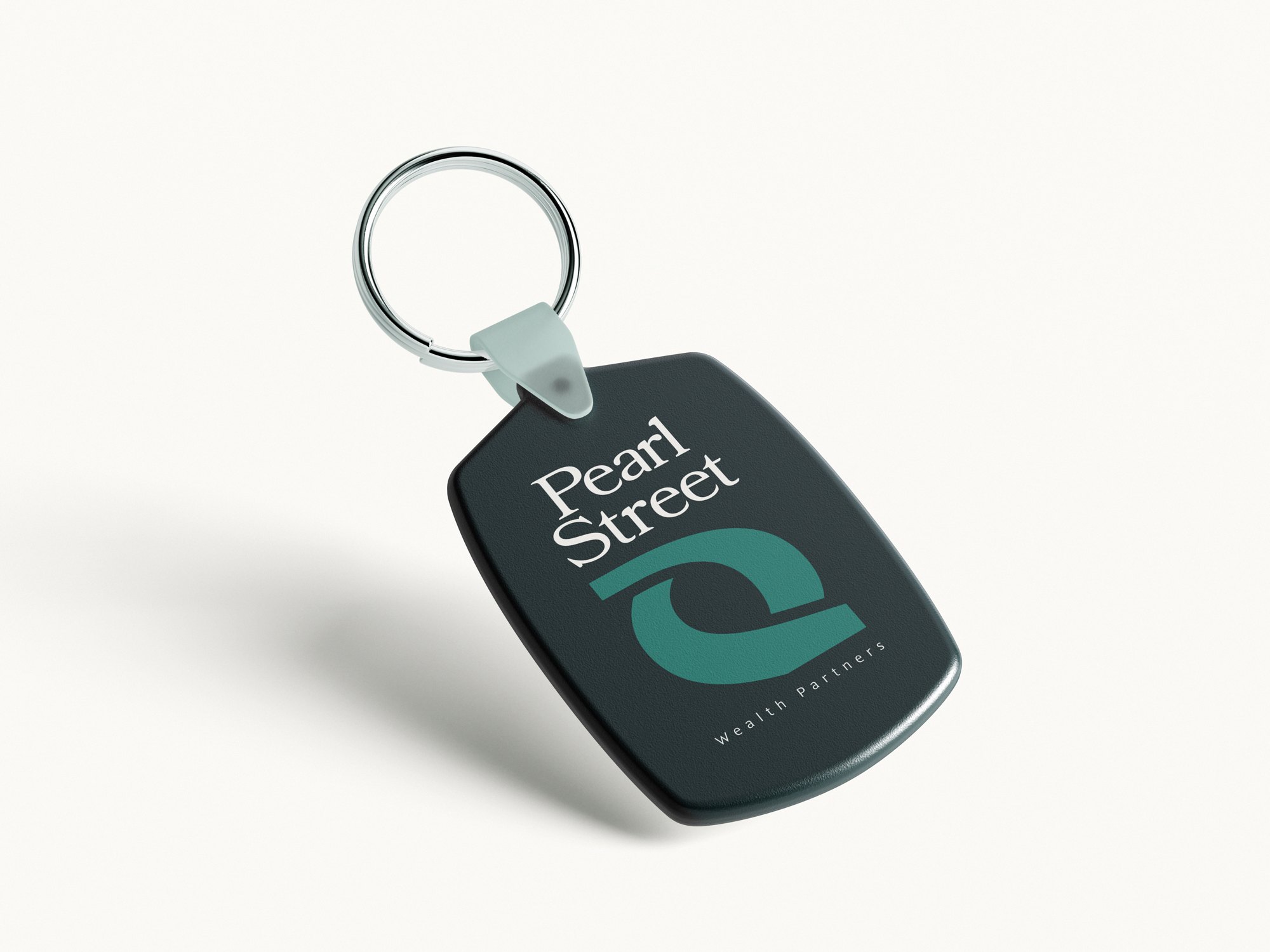
We developed the brand identity for Pearl Street Wealth Partners. The supplied graphic basics bring together a sculptural symbol, a Pearl Street wordmark, alternate logo arrangements, color palettes and typography.
The identity pairs deep green and mint tones with warm light neutrals, with Bookmania and Sommet type specimens in the guide. The message “Clarity for What Comes Next.” appears across the supplied brand applications.
The gallery explores that system through flags, signs, flyers, folders, binders, stationery, outdoor advertising and a keychain. These are branding mockups, not claims of a physical rollout. This project covers brand development only, not website design or financial-performance results.